It is impossible to underestimate the impact of colour. Selecting the right colours for your brand is essential to defining its identity, connecting emotionally with your target market, and maintaining consistency in all of your marketing collateral.
However, what is the proper process for choosing brand colours? In this extensive guide, we’ll precisely delve into that. Selecting brand colours that appeal to your target market and make an impact is an essential first step, whether you’re launching a new company, rebranding, or simply wanting to update the look of your existing brand. Let’s explore colour psychology, what to look for, and how to take action when selecting brand colours that will propel you forward.
The Psychology of Color
It is important that we understand the psychology of colour before we can begin the process of choosing brand colours. Colours can influence consumer behaviour, arouse feelings, and bring back memories. Assemblages and associations are communicated through various colours. Typical associations of colour include the following:
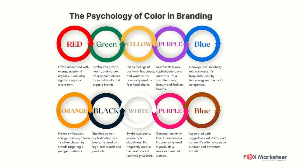
- Red: Often associated with energy, passion, and urgency. It can also signify danger or excitement.
- Blue: Conveys trust, reliability, and calmness. It’s frequently used by technology and financial companies.
- Green: Symbolizes growth, health, and nature. It’s a popular choice for eco-friendly and organic brands.
- Yellow: Elicits feelings of positivity, happiness, and warmth. It’s commonly used by fast-food chains.
- Purple: Represents luxury, sophistication, and creativity. It’s a favorite among beauty and fashion brands.
- Orange: Evokes enthusiasm, energy, and playfulness. It’s often chosen by brands targeting a younger audience.
- Black: Signifies power, sophistication, and luxury. It’s used by high-end brands and products.
- White: Symbolizes purity, simplicity, and cleanliness. It’s frequently used in the healthcare and technology sectors.
- Pink: Conveys femininity, love, and compassion. It’s commonly used in products and services aimed at women.
- Brown: Associated with ruggedness, reliability, and nature. It’s often chosen by outdoor and adventure brands.
You can choose brand colours that support the identity and message you want to communicate by being aware of these fundamental associations.
The Importance of Consistency
Consistency is key when it comes to branding. Your brand colors should be applied consistently across all your marketing materials and touchpoints. This consistency helps build brand recognition and trust. Imagine a world where the Coca-Cola logo switched between red and blue. It would be confusing for customers and detrimental to the brand’s image.
Consistency doesn’t stop at the color itself; it also applies to the shades, combinations, and usage of the colors. To maintain a consistent brand identity, create a brand style guide that outlines:
- Primary and Secondary Colors: Define your main brand colors, as well as secondary colors for accents.
- Color Variations: Specify different shades and variations of your brand colors for various use cases.
- Color Combinations: Detail how and where different colors should be used together, ensuring harmonious combinations.
- Logo Usage: Provide guidelines on how your logo should appear in terms of color.
- Typography: Pair typography with your color scheme for a cohesive look.
- Visual Elements: Include any other visual elements like icons or patterns that align with your brand’s color scheme.
Having a brand style guide ensures that everyone involved in your branding and marketing efforts, from designers to content creators & most important marketing consultant or marketing head, maintains a unified and consistent look and feel.
Identifying Your Brand’s Personality
Every brand has a unique personality, and your brand colors should reflect it. Are you a playful and youthful brand or a serious and professional one? Are you environmentally conscious or a luxury brand? Your brand’s personality should guide your color choices.
Here’s a step-by-step process to identify your brand’s personality:
- Define Your Brand’s Values: What values does your brand stand for? Sustainability, innovation, reliability, or something else? Your values will influence the perception of your brand.
- Understand Your Target Audience: Who are you trying to reach? Different demographics and psychographics respond differently to colors. Consider the preferences of your target audience.
- Competitor Analysis: Research your competitors and their branding. What colors are they using? You want to stand out while still fitting into your industry.
- Storytelling: Think about the story you want your brand to tell. The narrative you create can be enhanced by the colors you choose.
- Mood Board Creation: Start a mood board with images, colors, and visuals that represent your brand’s personality. This can be a helpful visual reference.
Creating a Color Palette
It’s time to develop your colour palette now that you have a better grasp of the psychology of colour, the value of consistency, and the personality of your brand. A colour palette is a collection of hues that you will employ in all of your marketing and branding collateral. This is how to make one:
- Start with a Base Color: Select a dominant color that represents your brand’s personality and values. This color will be the foundation of your palette.
- Choose Accent Colors: Choose one or two accent colours that go well with your base colour to give your palette more depth and adaptability. These can be applied to headers or call-to-action buttons, among other secondary elements.
- Neutral Colors: To balance your colour scheme and guarantee readability and clarity, use neutral hues like black, white, or grey. These are frequently utilised for borders, text, and backgrounds.
- Test Combinations: Experiment with different color combinations to ensure they work well together and evoke the desired emotions. Consider using color wheel tools and palettes to help you find harmonious combinations.
- Keep Accessibility in Mind: Ensure that your color choices are accessible to all users, including those with visual impairments. Use color contrast tools to verify that your text is legible against the background color.
Testing Your Brand Colors
Before finalizing your brand colors, it’s essential to test how they perform in various contexts. This involves assessing their versatility and adaptability across different media and platforms. Here are some key aspects to consider:
- Digital Media: Test your colors on digital platforms such as websites, social media, and email marketing. Ensure that your colors look consistent and appealing on various screens and devices.
- Print Materials: If you plan to use your brand colors in print materials like brochures, business cards, or packaging, test how they appear in print. Sometimes, colors can look different when printed.
- Backgrounds: Check how your colors appear against different backgrounds. Ensure that your text remains readable and that the colors maintain their impact.
- Scaling: Test how your colors scale up or down in size. Some colors might lose their appeal when used in small icons or enlarged banners.
- Cross-Platform Consistency: Make sure that your brand colors look consistent across all your digital and physical touchpoints. This includes your website, social media profiles, offline materials, and products.
The Role of Color in Logo Design
Your logo is often the first point of contact between your brand and your audience. The colors you choose for your logo can significantly impact the impression it makes. Here are some considerations when selecting colors for your logo:
- Simplicity: Keep your logo color palette simple. While it’s tempting to use multiple colors, a clean and straightforward design is often more memorable and versatile.
- Versatility: Think about how your logo will appear in various colour schemes. To accommodate different use cases, you should have a full-color version, a one-color version, and a black-and-white version.
- Emotional Impact: Choose colors that resonate with your brand’s personality and the emotions you want to evoke. Your logo should reflect your brand’s identity.
- Scalability: Make sure that, at any size, your logo still looks good. At all sizes, it should still be clear and impactful.
- Consistency: Your logo colors should align with your overall brand color palette. They should be an integral part of your brand’s visual identity.
Legal Considerations
It’s important to think through the legal implications before deciding on your brand’s colours. After spending a lot of time and money developing your brand, the last thing you want is to discover that someone else has the rights to it and uses a similar colour scheme. Here’s how to proceed:
- Trademark Search: Make sure that no company in your industry is already protecting the colours you plan to use by doing a thorough trademark search.
- Consult Legal Professionals: It’s wise to consult with intellectual property attorneys who specialize in trademarks. They can provide expert guidance on potential trademark issues.
- International Considerations: Be aware that trademark laws can vary from one country to another. If you plan to operate internationally, consider trademark registration in relevant regions.
- Monitor Your Trademarks: After registering your brand’s colors, be vigilant in monitoring and protecting your trademarks. Take legal action against any potential infringements.
Implementing Your Brand Colors
With your brand colors selected, it’s time to put them to use across all your marketing materials and channels. Here are some key areas where your brand colors should be consistently applied:
- Website and Online Presence: Ensure that your website design incorporates your brand colors. This includes headers, backgrounds, buttons, and links.
- Social Media Profiles: Customize your social media profiles with your brand colors. Use consistent visuals in your cover photos, profile pictures, and posts.
- Marketing Collateral: Apply your colors to all marketing collateral, including brochures, flyers, posters, and business cards.
- Packaging: If you sell physical products, your packaging should prominently feature your brand colors.
- Email Marketing: Incorporate your brand colors into your email templates to maintain a consistent look and feel in your communication with customers.
- Signage and Physical Locations: If you have physical stores or offices, make sure your brand colors are present in signage and interior design.
- Advertising: To strengthen your brand identity, use your brand colours in offline and online advertising.
Remember that consistency is the key to making your brand recognizable and memorable.
Evolving Your Brand Colors
It’s possible that your brand colours will need to alter as your company expands and changes. This might be the result of repositioning your brand, entering new markets, or changing your target demographic. Here’s a strategy for handling a colour change for your brand:
- Research and Analysis: Before making any changes, conduct thorough research to understand why a color change is necessary. Analyze market trends, customer feedback, and your business goals.
- Gradual Transition: If possible, consider a gradual transition rather than an abrupt change. This can help minimize confusion among existing customers.
- Rebranding Announcement: Inform your audience if you decide to alter your brand’s colours. Justify the alteration and emphasise how it continues the development of your brand.
- Update All Materials: Ensure that the new colour scheme is updated in all marketing materials, both offline and online. This covers your products, printed materials, social media accounts, and website.
- Consistency: Maintain consistency in your new colour scheme, just as you did with your original brand colours, to create a powerful and cohesive brand identity.
The Impact of Brand Colors on Marketing
Your brand colors play a significant role in your marketing efforts. Here’s how they impact various aspects of marketing:
- Brand Recognition: Consistent use of brand colors leads to better brand recognition. Consumers will easily associate your colors with your brand.
- Emotional Connection: Colors evoke emotions and can help create a deeper emotional connection with your audience. This can lead to increased brand loyalty.
- Call-to-Action (CTA): Your call to action’s effectiveness may be impacted by colour. For example, green can be connected to constructive actions, but red and orange are frequently used to convey a sense of urgency.
- Visual Content: Your content’s perception may be affected by the colours you choose for visual elements like photos and videos. Ensure that your images complement the colour palette of your brand.
- Cross-Channel Consistency: Consistency in your brand colors across different marketing channels, from social media to email marketing, ensures a unified brand identity.
- Competitor Differentiation: In a competitive market, a well-chosen colour scheme can make your brand stand out. A distinctive colour scheme can help you stand out from the competition.
Case Studies
Let’s examine a few case studies of companies that have chosen and used their brand colours effectively:
- Coca-Cola: The iconic red colour of Coca-Cola is easily recognised and is connected to joy and refreshment. This colour has been used by the brand continuously for decades.
- Facebook: Facebook’s blue logo and design reflect trustworthiness and reliability, aligning with its mission to connect people.
- Starbucks: Starbucks uses a combination of green and brown, representing growth and the company’s commitment to quality coffee. This color scheme aligns perfectly with their values.
- Apple: Apple’s sleek and minimalist logo uses monochromatic colors, emphasizing simplicity and sophistication in their product design.
- McDonald’s: McDonald’s iconic combination of red and yellow conveys energy and warmth, attracting customers with the promise of fast and tasty food.
These case studies highlight the power of consistent and well-chosen brand colors in creating strong brand identities.
Conclusion
Selecting brand colors is a critical decision in your branding and marketing strategy. Your brand colors should align with your brand’s personality, values, and target audience while considering the psychology of color. They should be applied consistently across all your marketing materials and tested for versatility.
Keep in mind that the power of your brand colours extends beyond aesthetics; they have an impact on how your target market views and relates to your company. I hope that after reading this guide, you have a thorough understanding of how to choose brand colours for memorable and consistent branding as a digital marketing consultant.
The creative and strategic process of choosing your brand’s colours can have a big influence on how successful it is. Making wise colour decisions can help you establish a brand that connects with your target market and endures over time, whether you’re launching a new business, rebranding, or simply wanting to update your existing one.
Please don’t hesitate to get in touch if you need help or have any questions about branding or digital marketing Services. Our top priority is the success of your brand, and we are here to help you along the way to captivating and successful branding.

Rakesh Bhosale is a seasoned digital marketing consultant with over 15 years of industry expertise. Specializing in lead generation, demand generation, branding, marketing automation, and digital transformation strategies, Rakesh’s comprehensive knowledge and hands-on experience drive remarkable growth and establish strong online presences.

